Web Design Studio
WAGI Digital

PROJECT STORYLINE:
ACT 1: The Set-Up
“What A Great Idea” (WAGI) is a web design studio that specializes in creating functional, easy-to-manage websites for entrepreneurs and small-to-medium enterprises. Their mission is to deliver websites that don’t just look great but work seamlessly for their clients, empowering them to easily manage their own digital presence without needing ongoing support. WAGI approached me with a desire to refresh their brand identity while retaining the core element of their original logo, a lightbulb, which symbolised creativity and innovative thinking.
ACT 2: The Challenge
The challenge was to update the original logo while staying true to its essence. The lightbulb motif was key, representing that ‘aha’ moment tied directly to the company’s ethos of generating great ideas for their clients’ web presence. The refreshed logo needed to retain that sense of innovation and creativity but modernize it to feel fresh and contemporary, appealing to a more digital-savvy audience. In addition, WAGI wanted to create brand identity elements beyond the logo—such as patterns and textures—that could be used across their marketing materials to unify their branding and create a cohesive look and feel.
ACT 3: The Resolution
We evolved the original logo by refining the lightbulb shape into a sleeker, more minimalist form that conveyed the concept of bright ideas in a modern, tech-forward way. The design emphasized clean lines and a vibrant color scheme, reflecting the studio’s focus on delivering both functionality and creativity. To complement the updated logo, I developed brand identity elements like patterns that could be integrated into WAGI’s website, social media graphics, and printed materials. These visual elements not only enhanced the brand’s recognizability but also created a more holistic identity that matched WAGI’s innovative and entrepreneurial spirit.
SERVICES:
Brand Identity Design
Stationary Design
Visual Asset Design


Logo Design | Process
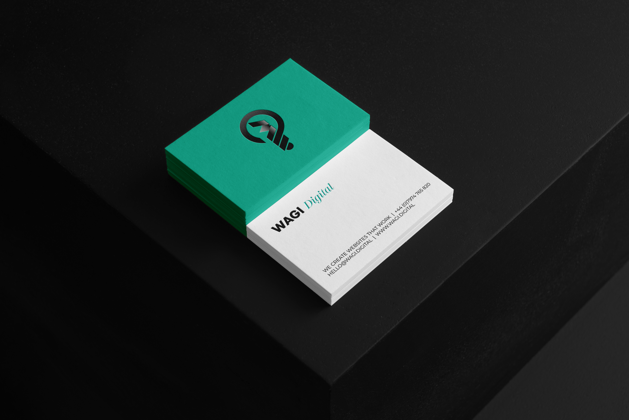
The challenge with this project was to take a well-loved logo that had been used for many years and update it in such a way as to make it more effective and for it to stand out with more clarity for the company.
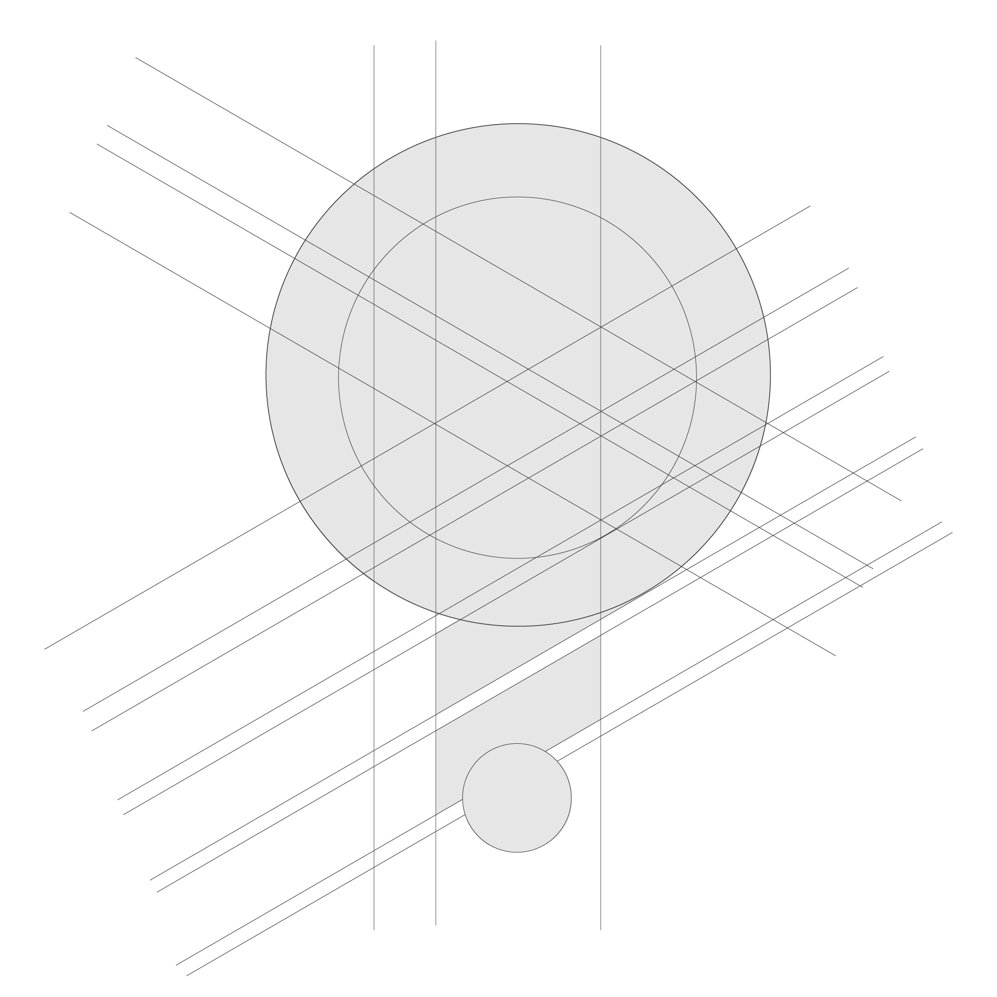
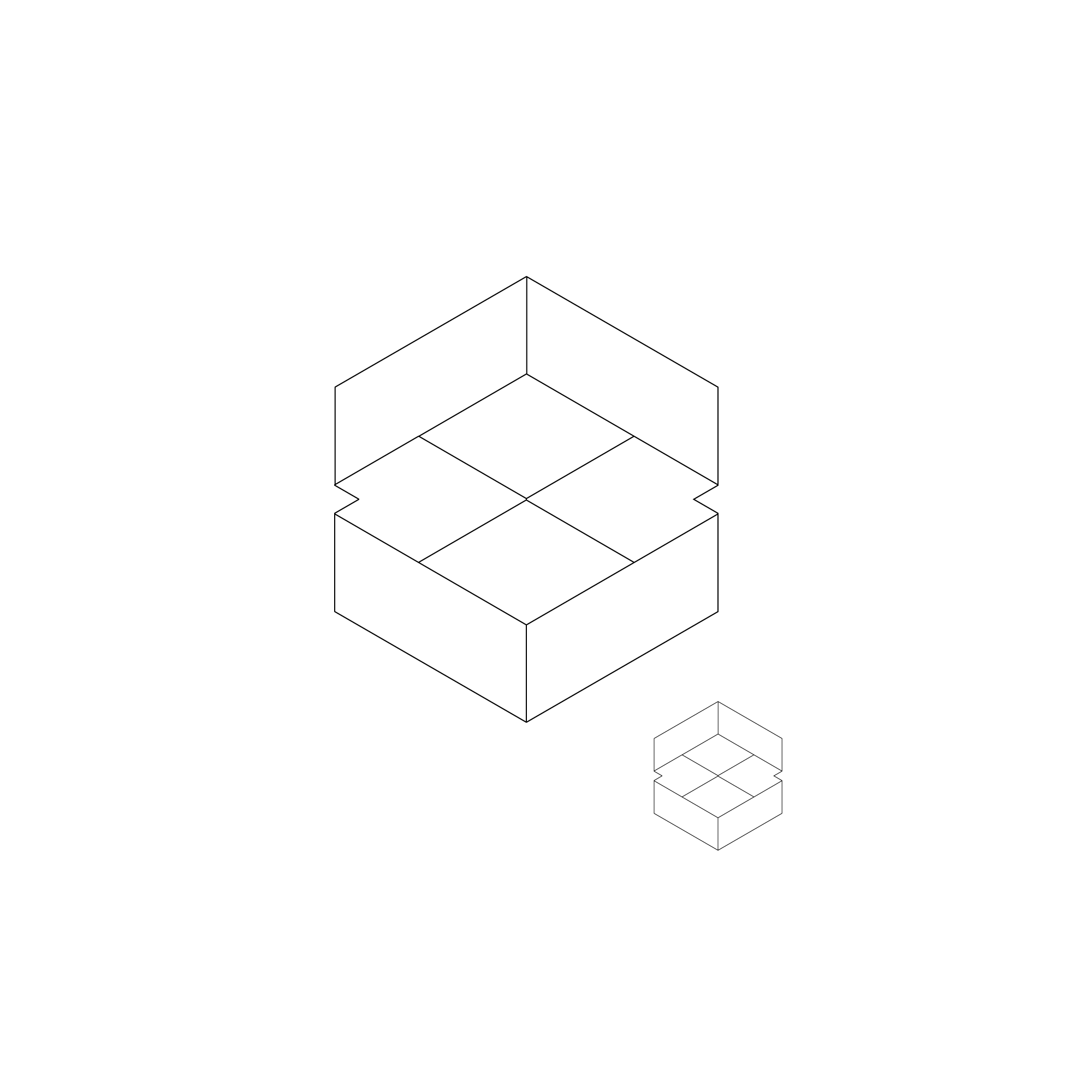
For the logo redesign, the foundation of the original logo concept was used as a guide, but the new logo was completely rebuilt, fine-tuning key elements that would allow for the broader design assets to add recognition and consistency to its marketing efforts. Of major significance was the creation of a brand pattern that would seamlessly integrate with its wider strategy.
Original Logos
New Logo
Brand Pattern
Let’s Talk Tech & Design Branding
Already have project in mind? If you’re looking for a logo design, visual identity, or any other design, I’d love to discuss with you.
Please drop me a message on the contact page and we can take it from there…


